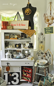
Megan's booth is long and narrow. Many vendors have narrow booths. The main challenge for a narrow booth is to make sure it doesn't feel like a cave or bowling alley or too linear. The tricks for arranging a narrow booth are very similar to tricks for decorating a narrow room in a house. There are too many tricks (and examples) for just one post, so in this post I'll address the short walls. The long walls will be the topic for the next post. Stay tuned!
 |
| Megan's Booth |
THE SHORT WALL
A hutch would be perfect on that wall as long as it's not a tall skinny one. Look at all the horizontal lines on the hutch below, thanks mainly to the shelves.
 |
| Source |
 |
| Source |
The short wall would also look good with a bit of roundness. Sometimes a booth can look overly linear without some circular shapes here and there. The example below has that, plus horizontal lines. There is no shelf on the table. Instead, there's a shelf on the wall. There are many shelves that work great on a pegboard wall.
 |
| Source |
Items on the short wall should make a wonderful statement. Take the time to create an eye-catching VIGNETTE. There needs to be plenty of desirable (popular) items, as well, so that customers will be drawn into your booth for a better look.
Here's another example of a pleasing vignette with plenty of horizontal lines for a short back wall -
 |
| Source |
SIGNS are good at drawing the eye to the back (or anywhere else you want to draw attention). Two of the photos above have nice signs. The space in the photo below is fairly narrow, but the Garden Love sign beckons you in.
 |
| Source |
COLOR can be used to draw the eye as well. You can do that with colorful items, perhaps in a color grouping. Plants can be used to add color. If you have a booth that is mostly whites and neutrals, plants add color without taking away from the look. I love the geranium on the hutch in the second photo. The hutch is beautiful, but the geranium display makes it even better.
The short wall can be painted a bright, cheery color (different from the long side walls) if the mall allows you to PAINT. The booth shown below (which I've shown in a previous post) is not a narrow booth, but it is a great example of using a fun color on an accent wall without crossing over into the tacky zone. This idea could go wrong, but remember - it's only paint and it's only one short wall. If you don't like it, change it, but don't decide til after everything is in place. Give it a week or so to see if it grows on you. You might be very surprised!
 |
| Source |
DIAGONALS
Another trick for a narrow booth is to lead the eye diagonally. I plan to talk about that more in the next post, but for the short wall, it could be nice to add a bit of angle to the vignette. It's another trick to make the booth seem less linear.
 |
| Source |
LIGHTING
Lighting can make a room feel lighter. The last thing you want is for your narrow booth to be dark. Additionally lighting can bring focus to particular objects or vignettes, instead of the narrow booth size.
On the back wall, it could be helpful to use small can lights that sit on the floor (aka up-lights). They shine up and bring light (and a feeling of space) to the corners. Make sure they don't shine into the eyes of someone standing in the booth! Aim more against the wall.
Lights shining from above on that back wall are nice as well. A chandelier could be used or something creative, like the lighted branches in the photo below.
 |
| Source |
Stay tuned for the next post about narrow booths, which will focus on the long walls.
Did you like this post? If so, I hope you'll comment, pin, or share!

