Pages

Friday, January 31, 2014

Why Did I Close My Booth?

In my very first post on this site - Introducing Vintage Show Off - I said my booth days were about to come to a screeching halt.  Prida, left a couple of comments about that, wondering why I quit having a booth.  I think this deserves a better explanation than I've given so far.  So here's my story for anyone who's curious.

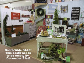
I used the words screeching halt because closing a booth and selling as much as you can before you have to get out, is a LOT of work.  I spent October and November and December working my fanny off.  By the end of December, it was all done and wow, I felt like I'd put on the brakes in my life and could sit and breathe.

Screeching halt didn't mean anything drastic or dramatic had happened.  I had been thinking about closing my booth for some time.  Why?  It wasn't making sense for me for a number of reasons.

ALL of my reasons have to do with TIME.

I am a retired teacher.  I spent 30 years of my life busy and pushed.  When I retired (blissfully at age 50 since I rushed thru school and started my career at age 20) I felt like I had all the time in the world and could take up anything.  I wanted to do something that would give me a bit of house decorating pocket money, but it had to be fun and nothing with set hours.  Having a booth was right up my alley.  But I over-extended myself.

I started by having a booth with a friend.  After a year or so, we split and had our own booths.
My First Tiny Booth on My Own

At some point, I became the promoter for the antique store where I had my booth.  I do the store's Facebook page, their blog, their Craigslist listings and their ads.  That took hours every day and I LOVED it - still do.

My original booth partner and I also became part of a 6-vendor booth called The White Booth.  The White Booth was amazing and such fun. All six of us were very different, but creative and the blended result was wonderful!  The idea was - most everything in the booth would be neutral, but every 6 weeks we'd add in a different color/theme.  It became very successful, which meant it was in a constant state of change. Just as we'd create a vignette, the anchor piece would sell.  I found myself working in that booth way too often.  But I loved it.  Really, really loved it.

The White Booth
You can see these photos and more over on the VSO Facebook Page.

I loved creating a pretty vignette. I love it so much that I could rearrange my booth every week if I had time. As if that weren't enough, I'd help others rearrange their booths if they'd let me.  I could lose a day at the store easily, just getting caught up in this and that and not accomplishing a darned thing for myself.

I loved hunting down treasures, painting and fixing up furniture, and painting signs but all of that was messy and VERY time consuming.  My house had piles of booth related projects EVERYWHERE.  Anyone who has a booth knows what I'm talking about.

My Ball Jar Sign

As if all that wasn't enough, I went in with some other vendors on a paint venture, which was fun and I knew it would be lucrative (and it IS!).

But... all the time I knew there were other things that I SHOULD be doing.  Priorities (and chores) I was neglecting.  I want to spend more time with friends and family. I do my husbands books for his company.  I do not enjoy that AT ALL  am sooo incredibly happy to be able to help with that, but it takes time.  We have to eat, and if I want our meals to be healthy, I have to cook.  A house should be cleaned periodically, right?   I don't have a maid and my hubby is not house trained, though I keep trying.

I was going in too many directions.  I was spread too thin.  I felt guilty all the time for not doing any of it the way it should be done. This was NOT how retired life is supposed to be. Something had to give.  I spent loads of time figuring out what I enjoyed most and what made the most sense.  I had to give up some things.

First, I gave up the paint thing.  Yes, it was going to be successful, but if I stayed in it, I knew it be be way too time-consuming. Plus, my heart wasn't in it.  I thought giving that up would be enough, but it wasn't.

I gave up The White Booth, which broke my heart.  If I was going to work that hard fixing up a booth, I should be concentrating on fixing up my own things.  Over time, my own booth, which I loved,  had become my lowest priority and that needed to change.  I wanted to fall back in love with my booth.

So for a year, my "pocket-money-hobby" was cut back to having one booth and doing the promoting for the store.

I still felt pulled, which surprised me.  I spent more time on promoting the store than on my booth.  I took a harder look at where my time went and what I liked about everything I was doing.

My Booth

I came up with a few thoughts about my booth.  I like arranging it and marketing it.  I like doing a bit of casual thrifting, but didn't like feeling pushed to do it constantly.   I didn't want to work as hard as I needed to to keep my booth full and I don't like a booth that has too little in it.  Also, one of my main reasons for having a booth in the first place was to use it as a method to transform my own house.  I hadn't made enough progress on that.  That priority had been pushed to the back, which was nuts.

Interestingly, by keeping the one thing I loved most - promoting for the store, I could continue to do the things I loved best about having a booth, but without pressure.  I still occasionally get involved in decorating spaces at the store, but just when I'm in the mood and have free time.  I still thrift, but now it's for my house.  I still get to see all my creative vendor friends on a regular basis.  And bonus - my real priorities are getting the attention they deserve.   AND I now have a little extra time to do something I've been dreaming of doing for a long long time - Vintage Show Off.  I sometimes wonder why I'm doing that.  What's in it for me?  I don't know.  I just know that I can help vendors and it makes me feel good to do that.  I've learned some things about having a booth and it seems crazy to not share that.

I think my personality is such that I CAN do lots of things.  But just because I CAN, doesn't mean I SHOULD.    My life is a balancing act and it's feeling more balanced now than it has in a long time.  I'm back in my happy place.

Do I miss having a booth?  Yes, but I know I'm doing the right thing right now.  Who knows.  One day I may open one up again.  Maybe after my husband retires and I am not forced to do the dreadful bookkeeping I don't need to help my wonderful husband with the bookkeeping anymore.   :-D

Thursday, January 30, 2014

Creative Jewelry Displays

Lots of vendors sell jewelry.  For some, it's the main income for their booth.  For others, it's a small display among other items in their booth.  Either way, it would be to your advantage to display your jewelry creatively.  


If you sell jewelry at all in your booth, take a look at the inspiration photos below.
I have more jewelry display photos in an album on the VSO Facebook page.


Source

Source - Includes How-To!

Source


Source


Source - Includes How-To

I have more jewelry display photos in an album on the VSO Facebook page.  I'll continue to add inspiration photos to that album in the future.

Tuesday, January 28, 2014

The One Wall Booth

What do you do when you have a one wall booth?  You stack the deck!  In other words, create a stacked vignette!


Chris posted a photo of her booth on the Vintage Show Off Facebook page.  It's a 6x6 ft wall space.  She would love suggestions and ideas and included this photo of her booth -

Be sure to check out this post to see how Chris very quickly reworked her booth!

Vertical Space
The first thing that struck me is that Chris has more space than she realizes.  Her space would seem larger if she added height.  The gathered ribbon across the top is like a line saying don't go above this spot.  I would remove the ribbon and begin using more height.

When placing things up high, there are a number of considerations.  Safety is foremost. Think about how easy the item would be to get down and make sure it's not something that is likely to knock out a customer! Customers need to be able to get a pretty good look at any objects put up high without taking them down. The price on things out of easy reach needs to be large and easy to see.


Make-Do Piece
Chris has a wire shelf, which is functional, but not necessarily stylish.  I think of shelves like this as make-do pieces.  When a main display piece sells, if you don't have another waiting to be brought in, you need something to make-do with til you find a replacement.  With the wire shelf look, Chris can still make sales, but with a bit of tweaking and creativity, a very stylish look could be created. People are willing to pay slightly higher prices in a pretty booth.  A prettier look would also cause customers to linger around the display a bit longer, increasing the chance for a sale.

Folding Bakers Racks make wonderful make-do pieces!

When you have a utilitarian make-do shelf,
you can soften the look with fabric.


Everything in most small booths should be for sale - even the anchor piece.  The table or anchor piece could be marked just a tad higher, unless you have back-ups.  Always try to have a backup anchor piece or a make-do piece, otherwise your whole look could end up a messy pile of stuff on the floor.  Think what this booth would look like if the black table sold and there was nothing to put in it's place -

This table doesn't have chairs or shelves stacked on top of the table, which would allow for better viewing of all the smalls, but it's still a pretty vignette.  I found this photo on Pinterest, but the link is an error.  If anyone knows the source, please let me know!  

Anchor Piece
Having a booth that is mostly a wall is pretty much like creating a booth vignette in a rectangular or square booth.  To create a vignette, you start by finding an anchor piece.  In a one-wall booth, the anchor piece isn't necessarily a fabulous, catch-your-eye thing.  It's the largest piece around which everything else will be arranged.

For the anchor piece of this booth, Chris might look for a table or desk or console about 4 ft long - sort of sofa table sized.  She could display things on top of the table and under it.  The piece should be as deep as space permits.  

A table like this would make a great anchor piece for a space where you can't come out very far from the wall.
Photo Taken at Queen of Hearts in Marietta, GA

A hutch or cabinet could also be used as the anchor piece. Bottom doors can be left open or removed and set to the side for more display space.

Photo Taken at Queen of Hearts in Marietta, GA

Photo taken at Rockin' B Antiques in Newnan, GA


Stacking
When possible, mid-sized items could be placed on top of the table - wood shelves, crates, cabinets, hutch tops, chairs - things that would be for sale AND used to create more display space.  Since the table wouldn't take up all the space,there would be room to put something else for sale on the side, adding to your look.  I have lots of examples of stacked vignettes - 

Source: somewhere on the Chippy Shabby blog.

Source: somewhere on the Sugar Pie Farmhouse blog.

Source

Source - somewhere  on the Summer Cottage Antiques site.

Source: somewhere on the Restoration House Interiors site


Color
In Chris's current look, she has some blue.  I would work in a bit more blue and make a statement.  She could bring in more color cheaply by stuffing blue tissue paper (or fabric)  in clear jars or in baskets or crates used to hold things you are selling.

Photo taken at Rockin' B Antiques in Newnan, GA


When you come home with treasures for your booth, sort smalls into color groups.  Store them at home in boxes by colors and/or seasons so they are easy to pull.    You'd switch the look for your booth (or vignette) every month or two.  You don't have to stick to just one color in your groupings.  Chris might choose another color to mix in with her blues.   See this post for more on color grouping.


In a one wall booth, the only wall you have is your money wall!  It can be great! You might even out-sell many typical full size booths.


This is a small one wall booth at Queen of Hearts in Marietta, GA.
This vendor has lots to sell in that tiny space!

I looked back through some of my previous VSO posts and found more vignette photos that would be great ideas for a booth like this, especially on The Money Wall  post.


Update: Feb 18 - Megan now has an anchor piece.  WOW!   Take a look at her booth now -


Saturday, January 25, 2014

More Banners and Buntings

I'd like to move on and post about something new - I have so many posts on my to-do list - but I  keep seeing so many photos of booths with banners.  I already did one post on banners this month and Jan commented that she'd like to see more photos of banners in booths.  I understand that comment completely!  It's the booth photos that are the most inspiring. When vendors come to this site, I'm sure that's what they'll be hoping to see lots of.  So here ya go - banners and buntings mostly in booths!


Remember the golden booth question when you look at these photos - Would you walk into the booth?  If so, what pulled you in?

One more tip - almost all of these source links lead to blog posts with more inspiring photos.  If you have time, they would make a fun browse!

Source is a direct pin on Pinterest by  3 French Hens

Source

Source

Source

Source

Dead link on Pinterest, but here's the Urban Farmgirl blog

This one's not in a booth, but I thought it was creative enough to include.  I couldn't help myself.
Cathy Guess on Flickr

Source
Sorry - this one is not in a booth, but I had to show you.  It's made with clipboards!

Source

Thursday, January 23, 2014

Prime Booth Location

When you first get a booth at a mall, your booth location isn't usually up to you.  You have to take whatever spot is open.  Once you are in the door, as vendors leave, you may have an opportunity to move to a better spot.  Some mall owners will let all the vendors know when a space is coming open in case anyone wants to move.  Some mall owners will rent the open spot to the next potential vendor on her list. Vendors already in the store are shocked and some may wish they'd had a chance at moving.  Either way, you should pick out the booths you would love to have and tell the owner if any of them ever come available to please consider you.  And then, to make sure you are a good candidate, you need to prove yourself worthy of a better spot by making  the absolute most of your current location.  If you have a lousy looking booth and/or poor sales, why would the owner want to put you in a prime location?  And stay on the owner's good side, for Heaven's sake!


All malls vary, but here are some general thoughts to help you figure out which are the best booths in your mall -

The right side of the aisle is usually better than the left.  Most people tend to look to the right a little more often.

Source

A wide booth is better than a narrow booth.  Wide booths give you more options for arranging and a better opportunity for creating eye catching displays.

If you sell lots of things than hang, then look for booths with plenty of wall space.

Lighting is important.  Some malls don't want you to turn on lamps and lights in your booth during the hot summer months.  If you have good lighting that's no big deal.  If you are in a dark spot, it's bad, especially if you are selling dark furntiure.

Source

One more caution about lighting.  Some malls have ceiling fans.  A ceiling fan situated just so - in the path of a ceiling light - can produce a very annoying strobe effect.  Standing in a booth with the strobe effect is very irritating and customers generally don't linger in booths with that issue.

Source

A corner booth can be good, but not all corner booths are equal.  It depends of the traffic flow.  Corners that face oncoming traffic are the best.  If the corner is usually to the customer's back, then it's not a prime corner.  In fact, it causes you to lose your money wall.  See more about traffic flow and the money wall in this post.


Source

Booths that can be seen from different spots in the store are good.  Booths that can be seen from several booths away, like a booth at the end of an aisle, can be really good.

Being in the main path of traffic is important.  You don't want a booth in an off-the-main-path area that some customers forget to walk to.  You also don't want a booth in a spot that is too congested or too crowded.  A customer standing in the aisle looking into the booth might feel hurried along as other people walk past.  You want a spot where folks can happily loiter.

I could argue either way for being near the entrance or near the exit.  Some customers spend more time in the first few booths.  But will they make purchases.  They might be reluctant to pick something up, thinking they have so much more to see.  They tell themselves they'll come back after they've gone through the store.  But they don't always go back.

Towards the end, some impulse shoppers really want to go home with some little something.  If they haven't seen anything they want and they find themselves with only a few booths to go, they might look closer at those last booths.  For that matter, they might also take another quick look at any booths near the register.  Other customers might be on overload by the time they get to the end.  They might rush through the last booths.

 Lots of vendors love those first and last booths.  I never cared one way or the other.

Personal Photo taken at Queen of Hearts in Marietta, GA

If you know you aren't happy with your current booth, avoid putting in semi-permanent structures. Make your decor very mobile.  With luck, you may get to move to a better location quickly.  In fact you may "move up" several times before you get a booth you love.  I moved 4 times within 2 years before I found the perfect booth for me.

One last booth location thought - know your potential booth neighbors.  There may be some neighbors that, for whatever reason, you'd rather not be beside. Moving next to them could make your vendor life a lot more complicated and who needs that?  Just sayin'!

If your location and your booth shape isn't the best, don't worry too much.  I have seen awesome vendors in bad locations with poorly shaped booths and bad lighting who did GREAT.  If you have great stuff to sell, customers will flock to your booth!!!  Still, it's nice to be where you feel happy.

Friday, January 17, 2014

Help - I Can't Sell This Vanity!

There are always an abundance of vintage vanities for sale at antique malls.  They look very pretty in a booth, but usually take a while to sell - longer than most other bedroom furniture.  Recently, two different vendors at the store I promote had to mark theirs down and down, until finally they were just $85 a piece. One of them still hasn't sold.   Why?


Here's my answer.  Vanities aren't sought after for every bedroom.  You seldom see one in a boy's room. They are nice in a girl's bedroom if the room is large enough.  Not every master bedroom needs one.  A vanity would be right at home in a master decorated in a shabby chic style.  It would be a harder fit for most other styles.  In a family home, many wives tread a fine line trying to keep the master balanced in terms of masculine and feminine.  A vanity is quite feminine.  In other words, the market for a vanity is fairly narrow.

First, you have to find someone who could use a vanity - a small percentage of shoppers.  On top of that, you'll need to have the size and shape and style and color they want at a price they're comfortable with.  If the vanity sells quickly, consider yourself very lucky.

What to do if you have a vanity that just won't sell?  I probably wouldn't mark it down to nothing unless I just wanted it gone and didn't mind taking a loss.

You have other options!!

If you don't want to wait out that eventual sale, you could break it up and show it as something other than a vanity.  It pains me to encourage someone to break apart a vintage piece.  I sure hope you don't have to break up a really pretty one that's in great shape.  But sometimes, you've gotta do what you've gotta do.

The least drastic option is to simply remove the mirror and market it more like a desk.  They often sell faster like this.  Mostly because now it's appealing to a larger market.  It could still be used as a vanity - just hang a separate mirror on the wall.  But now, it's also a desk and might be used in a number of rooms.  You just expanded your market!
All photo sources are listed at the bottom of post!

A low vanity could easily be turned into a storage bench.
All photo sources are listed at the bottom of post!

The mirror could be turned into a chalkboard and/or coat rack and sold separately - earning you even more profit on that vanity.  The base could be reworked to be used as an entertainment shelf or sink or....
All photo sources are listed at the bottom of post!


And of course, if you are willing to deconstruct the vanity (fairly easy), the sides could be sold as end tables, which tend to sell rather quickly.
All photo sources are listed at the bottom of post!

If you enjoyed this post, I sure hope you'll pin, leave comments, subscribe to the blog, like on Facebook, tell your vendor friends, etc!   Posts like these take ages to create and it sure would be nice to have a larger audience.  Even though this blog is fairly new, I sure hope it takes off soon!


PHOTO SOURCES

Desks:
White Desk - A Swell Place to Dwell 
Aqua Desk - Dead Link from Pinterest

Benches:
Top - The Centric Home
Bottom - B and Me

Other Options:
Sink - Dead Link from Pinterest
Back with Fan - Remodeloholic
Chalkboard Mirror - Refresh Restyle
Multicolor Shelf - The Smith Garage
Silver Rolling Shelf - Reuse Repurpose Recycle

Side tables:
Black Set - Apartment Therapy
White Set - Brambleberry Cottage
Quirky Red - Gadget Sponge on Etsy
Cream and Tan Set - Dead Link from Pinterest
Decoupaged - Three O'Clock on Tuesdays